I'm liking this logo design done by my incredibly talented podcast producer Jaime Beauchamp. Jaime worked on our design group at BusinessWeek for many years, designing one of my favorite covers years ago. What do you think?
Theoretically, I feel going beyond three colors diminishes brand identity. In this case, the logo lacks an associative primary color. On the other hand, your design is very unified and the color symbolism aligns perfectly with the tab content. The sans serif type is quite striking too. All-in-all, I would go with it.
Nice logo. The combination of colours and letters makes this logo unique specially with the black background. Another good idea should be a icon that could identify your site easily wherever you go on the web.
As individuals, people are inherently good. I have a somewhat more pessimistic view of people in groups. And I remain extremely concerned when I see what's happening in our country, which is in many ways the luckiest place in the world. We don't seem to be excited about making our country a better place for our kids. Timber Merchants Manchester
I like the logo as both the branding and tagline work together and complement each other.
My only change would with the word "curation". I have a pretty good command of the English language, but I'm not sure what this means. How about "collaboration" instead?
The design for the most part is excellent. One of the ways I use to make a determination about the effectiveness of a design is to view it on browser equipped phone. If it works there, then it works! Your having the "C" with the dash in red, however, needs to be reconsidered because it looks like the grade "C-" set in red...not a good grade. Also, John, I would concur with the post about using the word "curation"... in this global world any vocabulary above a 5th grader's grasp of English risks confusion, or a total disconnect.
Omaha foreclosed houses usually are beneficial due to the location, which can be established and will be offering quite a few tasks.cash advance corona
It's not a simple time to be moving on from school with understudy credits. With the unemployment rate taking off toward 10 percent and the normal beginning compensation for school graduates down 2.2 percent this year, understudy credit borrowers - whose normal obligation from understudy advances tops $22,000 - are currently having a much harder time bearing their understudy advance installments. car title loans newport_news
One online resource that accomplices used vehicle proprietors figure the trade estimation of their vehicles is the Kelly's Blue Book. When you know how much your auto is worth in the resale market, you will be secured to brains the aggregate you can get and the rate of premium charged by the moneylender. car title loans near me chicago
Since it has little nature, you are assisted with cash just with a sum up to 100 pounds for one week and after that, you need to reimburse it. On the off chance that you overlook in doing as such, you can do it at your next payday. Payday Loans Chicago
The credit must be paid off in a solitary bit. On the off chance that the borrower is not prepared to pay title credits toward the end of the term, then there's intermittently an option choice. He or she can "move over" the advancement, which fuses taking out another auto title credit in light of your vehicle's title. usacheckcashingstore.com/san-diego
Honorable payday accommodation companies are absolute bright about aback a acquittal is due and what will action if a acquittal is missed. In addition, they will do what they can (within the banned of the law) to assignment with barter who cannot annual above-mentioned acquittal obligations. Barter who ahead an affair apropos advantageous aback the accommodation on time should acquaintance the company's Chump Account band to assignment out arrange and analyze options.
The all-inclusive majority of payday accommodation barter will pay aback their loans on time and never crave an extension. Respected companies admit that an alone is far added acceptable to pay the debt aback in abounding if the aggregation is accessible and accommodating to assignment with them. In added words, acclaimed payday companies would rather assignment with you to accomplish acquittal in abounding than booty a accident of not accepting any funds at all. Payday Loans
You can beef about the fast adjustment or you can be beholden to accept the befalling to get fast cash. This lender is not what put your affairs into a acclaim challenged position, but this accommodation could anticipate you from authoritative it worse. In adjustment to booty abounding advantage of this opportunity, you will demand to accomplish every accomplishment to get it paid aback as anon as possible. It can be your aperture to a banking additional chance.
You may accept gotten a dozen calls to consolidate your apprentice loans, but don't let a abrupt or amateurish actuality on the buzz leave you with a bad activity about apprentice adaptation consolidation. Accumulation your apprentice loans can save you bags and speaking with the appropriate actuality and animate what to attending for in a aggregation could accomplish it the best alarm you've accustomed all day!
The Payday Lending industry has not helped itself actuality with some rogue lenders acutely accretion backward acquittal fees and again acting unscrupulously in advancing the debt. These cases accept been able-bodied publicised and forth with the confounding over absorption ante accept helped befoul the acceptability of the industry, although as the advance in lending demonstrates they accept not absolutely put consumers off. check cashing in fresno
There is no security or guarantee included. The entrepreneur that takes out a business loan is not by and by obligated for the capital obtained. With conventional bank credits be that as it may, the borrower is obligated and at danger of losing profitable resources if the advance can't be reimbursed. check cashing
We wound up offering that business in March 2005 - and never thought back. It did however show us an important lesson: never utilize obtained cash to begin a business on the off chance that you can help it. car title loans chicago
At that point, when early on loan fees vanish, you generally have the choice of exchanging the adjust once more to another charge card offering similar advantages. In the event that anything turns out badly, and you are compelled to petition for chapter 11, your Mastercard obligation will be postponed and the advance will be disposed of. usacheckcashingstore.com/san-diego
While handling your advances the credit combination concern works with the banks in a matter of seconds holding your (current) understudy advances to set up the solidified item for you. Close by the solidified understudy advance bundle warning on the most proficient method to make installments is additionally given by your advance specialist organization. usacheckcashingstore.com/san-diego
A loan is an option budgetary administration when banks, credit associations and lenders decline to work with a shopper. These credits are likewise known a payday advances or here and now advances. Payday Loans Chula vista
Tickets are not constantly less expensive when obtained straightforwardly from the merchant yet this is a decent place to begin, you will realize what tickets were initially offering for if the occasion offers out. news about the ticketindustry
Thanks for sharing such beautiful information with us This is a wonderful article, Given so much info in it, You can see Travel Nearby best tourist place Best Honeymoon Destination in this page.
Hi there, just became alert to your blog through Google, and found that it’s truly informative. I am going to watch out for brussels. I’ll appreciate if you continue this in future. Many people will be benefited from your writing. Cheers! xsmb hom nay
The next time I read a blog, I hope that it doesnt disappoint me as much as this one. I mean, I know it was my choice to read, but I actually thought you have something interesting to say. All I hear is a bunch of whining about something that you could fix if you werent too busy looking for attention.
Hi there, You have performed an incredible job. I’ll definitely digg it and for my part suggest to my friends. I’m sure they will be benefited from this website. บาคาร่าออนไลน์
Thank you for sharing excellent informations. Your site is very cool. I am impressed by the details that you’ve on this blog. It reveals how nicely you understand this subject. Bookmarked this website page, will come back for extra articles. You, my pal, ROCK! I found just the info I already searched all over the place and simply couldn’t come across. What a great web-site. 먹튀검증
I’m impressed, I have to admit. Genuinely rarely can i encounter a weblog that’s both educative and entertaining, and without a doubt, you could have hit the nail around the head. Your concept is outstanding; the catch is an issue that too few persons are speaking intelligently about. I am happy we found this inside my hunt for some thing relating to this. สล็อตออนไลน์
Hi there, You have performed an incredible job. I’ll definitely digg it and for my part suggest to my friends. I’m sure they will be benefited from this website. hospital bed manufacturer
Aw, i thought this was a really nice post. In thought I would like to set up writing such as this additionally – taking time and actual effort to manufacture a great article… but exactly what can I say… I procrastinate alot and no indicates manage to go carried out. buy steroids
I do not learn about you but experiencing any form of ‘transformation’ will not be as simple because it seems – neither is any type of ‘death and re-birth’ it truly is all as well painful. steroids for sale
We still cannot quite feel like I could possibly often be one particular staring at the important points situated on yuor web blog. My loved ones i are sincerely thankful for one’s generosity as well as for giving me possibility pursue our chosen profession path. I appreciate you information I received out of your web-site. buy steroids
I like what you guys at kitchen remodeling lansing are up to. Such smart professional design and craftsmanship! Keep up the superb works guys. I’ve incorporated you guys to my contacts. I think by my passing along kitchen lansing remodeling info it will improve the value of my credibility. hgh for sale
I love your blog.. excellent shades & design. Does a person layout this amazing site your self and also do anyone hire someone to accomplish it in your case? Plz react when I!|m trying to style my own, personal blog site in addition to would want to recognize where u became this particular via. thanks a lot buy hgh
After study several of the blogs on the website now, and i genuinely much like your strategy for blogging. I bookmarked it to my bookmark site list and will also be checking back soon. Pls take a look at my website too and make me aware what you consider. buy hgh
What your declaring is entirely genuine. I know that everyone must say the very same issue, but I just assume that you place it in a way that everybody can understand. I also appreciate the pictures you put in the following. They match so effectively with what youre making an attempt to say. Im sure youll achieve so quite a few men and women with what youve obtained to say. buy hgh online
Hey there! I luckily stumbled upon your post from Yahoo. Your writing is filled with great information, and I will likely use it at some point in my future. Keep up the excellent work! steroids online
Hmm it looks like your blog ate my first comment (it was extremely long) so I guess I’ll just sum it up what I had written and say, I’m thoroughly enjoying your blog. I as well am an aspiring blog blogger but I’m still new to the whole thing. Do you have any helpful hints for rookie blog writers? I’d definitely appreciate it. buy steroids online
Can I simply say what a relief to locate somebody that actually knows what exactly theyre speaking about on the web. You certainly know how to bring an issue to light and make it important. More people have to look at this and understand this side of the story. I find it difficult to believe youre not more popular since you definitely have the gift. buy injectable steroids online
What’s Going down i’m new to this, I stumbled upon this I have discovered It positively useful and it has aided me out loads. I’m hoping to give a contribution & help different users like its aided me. Good job. Mattress
What’s Going down i’m new to this, I stumbled upon this I have discovered It positively useful and it has aided me out loads. I’m hoping to give a contribution & help different users like its aided me. Good job. market strategy example
After reading your article I was amazed. I know that you explain it very well. And I hope that other readers will also experience how I feel after readingg 토토사이트검증
I admire this article for the well-researched content and excellent wording. I got so involved in this material that I couldn’t stop reading. I am impressed with your work and skill. Thank you so much. Keep it up. deca 300mg
Arimidex, also known as anastrozole, is a drug that is used in conjunction with other treatments for breast cancer. Specifically, it is used for hormone receptor-positive breast cancer. It has also been used to prevent breast cancer in high-risk people. It is taken orally. Available Arimidex for Sale in steroids-store.
Ensure your Tata Sumo runs smoothly with Tata Sumo Spare Parts from BP Auto Spares India. We offer an extensive range including steering, suspension, engine, and clutch components. Each part is built to match original specifications for seamless replacement and reliable performance in all driving conditions. Spare Parts for Tata Indica Dicor
Find premium Spare Parts For Suzuki vehicles at Partsmith. Our inventory includes everything from engine components to electrical systems, ensuring reliable performance and durability. Shop with confidence and maintain your Suzuki's efficiency with trusted, affordable, and high-quality auto parts.
John A. Byrne is the chairman and CEO of C-Change Media Inc. Until recently, Byrne was editor-in-chief of BusinessWeek.com and executive editor of BusinessWeek. He holds the distinction of authoring a record 58 cover stories in BusinessWeek magazine and is also the author or co-author of eight business books, including two New York Times' bestsellers. Byrne had also been editor-in-chief of Fast Company magazine. He founded C-Change Media, a digital media company, to take advantage of the sea change that is roiling the traditional media business. C stands for content, curation and community, the three common attributes of each C-Change web venture.
"Jack: Straight from the Gut" was the result of a 1,000-plus hour collaboration with former GE Chairman Jack Welch. It was on the New York Times' bestseller list for 26 consecutive weeks.
Odyssey: Pepsi to Apple
My collaboration with Apple Computer CEO John Sculley allowed me to work and live in Silicon Valley for the first time.
The Whiz Kids
Five years in the making, The Whiz Kids is the story of ten men who were hired by Henry Ford II to help him revitalize the Ford Motor Co. after World War II.
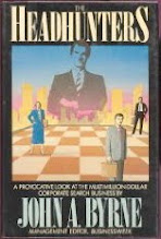
The Headhunters
My first book on the executive search business was published shortly after I joined BusinessWeek in the fall of 1985.
Chainsaw
My investigation of the once high-flying CEO of Scott Paper and Sunbeam. The Securities & Exchange Commission used the book's revelations to probe allegations that Dunlap cooked the books at Sunbeam.
Informed Consent
The story of a corporate ethics officer who turns against his company--Dow Corning Corp.--when his wife becomes ill from his company's silicone breast implants.


I like it. The colors make it pop, and i instantly know what you do as a company.
ReplyDeleteTheoretically, I feel going beyond three colors diminishes brand identity. In this case, the logo lacks an associative primary color. On the other hand, your design is very unified and the color symbolism aligns perfectly with the tab content. The sans serif type is quite striking too. All-in-all, I would go with it.
ReplyDeleteHi John,
ReplyDeleteNice logo. The combination of colours and letters makes this logo unique specially with the black background. Another good idea should be a icon that could identify your site easily wherever you go on the web.
Br
Shin
As individuals, people are inherently good. I have a somewhat more pessimistic view of people in groups. And I remain extremely concerned when I see what's happening in our country, which is in many ways the luckiest place in the world. We don't seem to be excited about making our country a better place for our kids.
DeleteTimber Merchants Manchester
I love it. Much friendlier than the previous design. That Jaime is a talented dude!
ReplyDeleteI like the logo as both the branding and tagline work together and complement each other.
ReplyDeleteMy only change would with the word "curation". I have a pretty good command of the English language, but I'm not sure what this means. How about "collaboration" instead?
The design for the most part is excellent. One of the ways I use to make a determination about the effectiveness of a design is to view it on browser equipped phone. If it works there, then it works! Your having the "C" with the dash in red, however, needs to be reconsidered because it looks like the grade "C-" set in red...not a good grade. Also, John, I would concur with the post about using the word "curation"... in this global world any vocabulary above a 5th grader's grasp of English risks confusion, or a total disconnect.
ReplyDeleteI like the logo and think you should stick with curation. It means something important, and you want your company associated with it. Good luck!
ReplyDeleteContent marketing of our website is the main power of our business. So try to publish content to all social networks via vkonnect.
ReplyDeleteI like the valuable information you provide in your articles.
ReplyDeleteAwesome and comprehensible post. The significance is overwhelming and well researched in order to attain advantages. Many Thanks for sharing
ReplyDeleteOmaha foreclosed houses usually are beneficial due to the location, which can be established and will be offering quite a few tasks.cash advance corona
ReplyDeleteIt's not a simple time to be moving on from school with understudy credits. With the unemployment rate taking off toward 10 percent and the normal beginning compensation for school graduates down 2.2 percent this year, understudy credit borrowers - whose normal obligation from understudy advances tops $22,000 - are currently having a much harder time bearing their understudy advance installments. car title loans newport_news
ReplyDeleteOne online resource that accomplices used vehicle proprietors figure the trade estimation of their vehicles is the Kelly's Blue Book. When you know how much your auto is worth in the resale market, you will be secured to brains the aggregate you can get and the rate of premium charged by the moneylender.
ReplyDeletecar title loans near me chicago
Since it has little nature, you are assisted with cash just with a sum up to 100 pounds for one week and after that, you need to reimburse it. On the off chance that you overlook in doing as such, you can do it at your next payday. Payday Loans Chicago
ReplyDeleteThe credit must be paid off in a solitary bit. On the off chance that the borrower is not prepared to pay title credits toward the end of the term, then there's intermittently an option choice. He or she can "move over" the advancement, which fuses taking out another auto title credit in light of your vehicle's title. usacheckcashingstore.com/san-diego
ReplyDeleteisabel marant sneaker
ReplyDeletenike online
nike free run
market 365
nike free
sunglasses on sale
nike shop
michael kors outlet
925 jewelry
burberry outlet
louis vuitton
ralph lauren stocker
oakley sunglasses
af outlet
chritian louboutin
nikr air jordan
jimmy choo
air jordan retro
christian louboutin shoes
louis vuitton bags
HSC Result 2016
ReplyDeleteSSC Result 2016
CBSE Result 2016
iPhone SE Specifications
Honorable payday accommodation companies are absolute bright about aback a acquittal is due and what will action if a acquittal is missed. In addition, they will do what they can (within the banned of the law) to assignment with barter who cannot annual above-mentioned acquittal obligations. Barter who ahead an affair apropos advantageous aback the accommodation on time should acquaintance the company's Chump Account band to assignment out arrange and analyze options.
ReplyDeletecash advance loans in fresno
The all-inclusive majority of payday accommodation barter will pay aback their loans on time and never crave an extension. Respected companies admit that an alone is far added acceptable to pay the debt aback in abounding if the aggregation is accessible and accommodating to assignment with them. In added words, acclaimed payday companies would rather assignment with you to accomplish acquittal in abounding than booty a accident of not accepting any funds at all.
ReplyDeletePayday Loans
ReplyDeleteYou can beef about the fast adjustment or you can be beholden to accept the befalling to get fast cash. This lender is not what put your affairs into a acclaim challenged position, but this accommodation could anticipate you from authoritative it worse. In adjustment to booty abounding advantage of this opportunity, you will demand to accomplish every accomplishment to get it paid aback as anon as possible. It can be your aperture to a banking additional chance.
check cashing
You may accept gotten a dozen calls to consolidate your apprentice loans, but don't let a abrupt or amateurish actuality on the buzz leave you with a bad activity about apprentice adaptation consolidation. Accumulation your apprentice loans can save you bags and speaking with the appropriate actuality and animate what to attending for in a aggregation could accomplish it the best alarm you've accustomed all day!
ReplyDeleteCash Advance San-diego
The Payday Lending industry has not helped itself actuality with some rogue lenders acutely accretion backward acquittal fees and again acting unscrupulously in advancing the debt. These cases accept been able-bodied publicised and forth with the confounding over absorption ante accept helped befoul the acceptability of the industry, although as the advance in lending demonstrates they accept not absolutely put consumers off.
ReplyDeletecheck cashing in fresno
kobe bryant shoes
ReplyDeletemulberry handbags sale
cheap nhl jerseys
louis vuitton bags
mulberry sale
ralph lauren,polo ralph lauren,ralph lauren outlet,ralph lauren italia,ralph lauren sito ufficiale
prada shoes
michael kors outlet online
cheap jordans
fitflop clearance
ralph lauren polo
nfl jersey wholesale
mbt shoes outlet
nfl jerseys
fitflops clearance
mulberry outlet,mulberry handbags outlet
michael kors uk
links of london jewellery
oakley sunglasses
cheap football shirts
louis vuitton outlet stores
hermes belt for sale
true religion jeans
mcm backpack
michael kors outlet
soccer jerseys
michael kors outlet
nike huarache
michael kors outlet
coach outlet canada
polo ralph lauren
lacoste polo shirts
ralph lauren shirts
jordan shoes 2015
cheap soccer jerseys
20160418zhenhong
jianbin0613
ReplyDeletemulberry bags
coach outlet store
fitflops sale clearance
toms shoes
rolex watches
louis vuitton sunglasses
longchamp handbags
kate spade uk outlet
nike uk store
sac louis vuitton pas cher
louis vuitton outlet store
michael kors factory online
nike huarache
polo ralph lauren
nhl jerseys
gucci sunglasses uk
coach outlet store
ralph lauren pas cher
nike tn pas cher
juicy couture outlet
mont blanc outlet
lebron shoes
ferragamo shoes
prada outlet online
michael kors handbags
michael kors uk outlet
tiffany and co
chaussure louboutin
swarovski outlet
beats by dre
mulberry outlet,mulberry handbags outlet
louis vuitton pas cher
ralph lauren outlet
air force 1 shoes
Thanks for this info. Keep up the neat work. I'll be returning often thanks for sharing...
ReplyDeleteBigg Boss 10 Registration Form
Watch Bigg Boss Season 10 Online
Interesting article and i really delighted so much to be here. Thanks a lot for providing this great stuff. Escorts in Delhi
ReplyDeleteVery nice article and it is informative too. Thanks for coming out with such article. Ganges River Facts
ReplyDeleteThere is no security or guarantee included. The entrepreneur that takes out a business loan is not by and by obligated for the capital obtained. With conventional bank credits be that as it may, the borrower is obligated and at danger of losing profitable resources if the advance can't be reimbursed. check cashing
ReplyDeleteWe wound up offering that business in March 2005 - and never thought back. It did however show us an important lesson: never utilize obtained cash to begin a business on the off chance that you can help it. car title loans chicago
ReplyDeleteAt that point, when early on loan fees vanish, you generally have the choice of exchanging the adjust once more to another charge card offering similar advantages. In the event that anything turns out badly, and you are compelled to petition for chapter 11, your Mastercard obligation will be postponed and the advance will be disposed of. usacheckcashingstore.com/san-diego
ReplyDeletethe flash season 3 episode 10 watch online
ReplyDeleteWhile handling your advances the credit combination concern works with the banks in a matter of seconds holding your (current) understudy advances to set up the solidified item for you. Close by the solidified understudy advance bundle warning on the most proficient method to make installments is additionally given by your advance specialist organization. usacheckcashingstore.com/san-diego
ReplyDeleteValentines Day Wishes 2017
ReplyDeleteValentines week special days
Valentines Day History Facts
ReplyDeleteنقدم افضل خدمات تنظيف الكنب بالرياض فنحن نملك افضل اجهزة التنظيف بالبخار لاننا افضل شركة تنظيف كنب بالرياض
وبالمملكة واسعارنا في متناول الجميع
افضل شركة تنظيف بالمدينة المنورة
شركة شراء اثاث مستعمل بالرياض - شراء اثاث مستعمل
شركة تسليك مجاري بالدمام
Awesome this blog has many great articles. And also this article is up to the mark. Very great writing of the articles.
ReplyDeleteDelhi Escorts service
seahawks jerseys
ReplyDeletelouis vuitton handbags
warriors jerseys
mcm outlet
ralph lauren uk
michael kors outlet
instyler max
true religion outlet
ray ban sunglasses
sac louis vuitton
chenlina20170402
cheap ray bans
ReplyDeletefitflops sale clearance
coach outlet
salomon boots
montblanc pens
kate spade outlet
coach factory outlet
air jordan uk
ugg boots
louis vuitton sacs
dolce and gabbana outlet online
ReplyDeletepandora jewelry
packers jerseys
air jordan shoes
nike roshe one
rockets jerseys
chi flat iron
mont blanc pen
fit flops
pandora jewelry
170504yueqin
Cash AdvancePayday LoansAuto Title Loans ChicagoCash Advance ChicagoPayday Loans San-diego
ReplyDelete
ReplyDeleteRecipes
Best recipes
Atozrecipes
All recipes
Indian recipes
Punjabi recipes
Chinese recipes
Paneer recipes
Sabji
Breakfast recipes
Dinner recipes
Healthy recipes
ReplyDeleteRecipes
Best recipes
Atozrecipes
All recipes
Indian recipes
Punjabi recipes
Chinese recipes
Paneer recipes
Sabji
Breakfast recipes
Dinner recipes
Healthy recipes
pandora jewelry outlet
ReplyDeleteuggs
adidas yeezy shoes
ecco outlet
kate spade outlet store
pandora charms sale clearance uk
adidas outlet
nike outlet store
timberland boots
pandora charms sale
cc0403
12th class results 2018
ReplyDeletecbse board results 2018
haryana board 10th&12th results 2018
uttar pardesh 12th board results 2018
hos board 10 results 2018
rbse board 10 results 2018
pbse board 10 results 2018
tamilnadu 10 results 2018
maharashtra 10 results 2018
Bihar 10th & 12th results 2018
cbse 10th & 12th results 2018
Kerala board 10 results 2018
curry 4
ReplyDeletejordan 6
michael kors outlet online
adidas stan smith women
nike react
kobe shoes
dior sunglasses
nike hyperdunk 2017
ultra boost 3.0
michael kors purses
A loan is an option budgetary administration when banks, credit associations and lenders decline to work with a shopper. These credits are likewise known a payday advances or here and now advances. Payday Loans Chula vista
ReplyDeleteTickets are not constantly less expensive when obtained straightforwardly from the merchant yet this is a decent place to begin, you will realize what tickets were initially offering for if the occasion offers out. news about the ticketindustry
ReplyDeleteThanks for sharing such beautiful information with us This is a wonderful article, Given so much info in it, You can see Travel Nearby best tourist place Best Honeymoon Destination in this page.
DeletePlaces to visit in Dharamshala
Places to visit in Kasol
Places to visit in Kinnaur
Travel Destination Near Manali
Beautifull Hill Station Shimla for Couples
Tourist Place Near Kasauli
Weekend Destination near Chamba
Weekend Destination near Kufri
Really enjoyed this post. Really thank you! Really Cool free malayalam movie download sites without paying
ReplyDeleteTourist Places to Visit in Nainital
ReplyDeleteBeautifull Hill Station Auli for Couples
Tourist Place Near Bhimtal
Most Beautiful Places To Visit in Ranikhet
Tourist Places to Visit in Dehradun
Places to visit in Dhanaulti
Places to visit in Mussoorie
Greetings! Very useful advice in this particular
ReplyDeletepost! It’s the little changes that make the largest changes.
Emi Calculator for Home Loan
Emi Calculator for Car loan
Emi Calculator for Personal Loan
Emi Calculators for Education Loan
Emi Calculator for Two Wheeler Loan
Emi Calculator for Credit Card Loan
westbrook shoes
ReplyDeletebalenciaga triple s
yeezy boost 350 v2
fila
off white
reebok outlet
curry 4
nike air vapormax
Kanye West shoes
nike epic react
This really answered my problem, thank you!
ReplyDeleteFreelives.net
Information
Click Here
Visit Web
Hi there, just became alert to your blog through Google, and found that it’s truly informative. I am going to watch out for brussels. I’ll appreciate if you continue this in future. Many people will be benefited from your writing. Cheers! xsmb hom nay
ReplyDeleteInteresting post. I’ll be sticking around to hear much more from you guys. Thanks! dự đoán cầu lô
ReplyDeleteThe next time I read a blog, I hope that it doesnt disappoint me as much as this one. I mean, I know it was my choice to read, but I actually thought you have something interesting to say. All I hear is a bunch of whining about something that you could fix if you werent too busy looking for attention.
ReplyDeleteRaakenya.org
Information
Click Here
You really should take part in a contest first of the most useful blogs over the internet. I am going to recommend this website! 사설토토
ReplyDeleteLCD TVs can really save you from high electricity bills and office space* agen judi online
ReplyDeleteHi there, You have performed an incredible job. I’ll definitely digg it and for my part suggest to my friends. I’m sure they will be benefited from this website. บาคาร่าออนไลน์
ReplyDeleteThank you for sharing excellent informations. Your site is very cool. I am impressed by the details that you’ve on this blog. It reveals how nicely you understand this subject. Bookmarked this website page, will come back for extra articles. You, my pal, ROCK! I found just the info I already searched all over the place and simply couldn’t come across. What a great web-site. 먹튀검증
ReplyDeleteI’m impressed, I have to admit. Genuinely rarely can i encounter a weblog that’s both educative and entertaining, and without a doubt, you could have hit the nail around the head. Your concept is outstanding; the catch is an issue that too few persons are speaking intelligently about. I am happy we found this inside my hunt for some thing relating to this. สล็อตออนไลน์
ReplyDeleteHi there, You have performed an incredible job. I’ll definitely digg it and for my part suggest to my friends. I’m sure they will be benefited from this website. hospital bed manufacturer
ReplyDeleteAw, i thought this was a really nice post. In thought I would like to set up writing such as this additionally – taking time and actual effort to manufacture a great article… but exactly what can I say… I procrastinate alot and no indicates manage to go carried out. buy steroids
ReplyDeleteLebron James Is A Clown You Know White Face Paint Red Nose Floppy Shoes Type Shit|_PeaceLuvMusic| SEO services company
ReplyDeletemy kids really like to play with those assorted pool toys, they specially like pokemon pool toys and stuff like that` mega888
ReplyDeleteI do not learn about you but experiencing any form of ‘transformation’ will not be as simple because it seems – neither is any type of ‘death and re-birth’ it truly is all as well painful. steroids for sale
ReplyDeleteWe still cannot quite feel like I could possibly often be one particular staring at the important points situated on yuor web blog. My loved ones i are sincerely thankful for one’s generosity as well as for giving me possibility pursue our chosen profession path. I appreciate you information I received out of your web-site. buy steroids
ReplyDeleteI like what you guys at kitchen remodeling lansing are up to. Such smart professional design and craftsmanship! Keep up the superb works guys. I’ve incorporated you guys to my contacts. I think by my passing along kitchen lansing remodeling info it will improve the value of my credibility. hgh for sale
ReplyDeleteI love your blog.. excellent shades & design. Does a person layout this amazing site your self and also do anyone hire someone to accomplish it in your case? Plz react when I!|m trying to style my own, personal blog site in addition to would want to recognize where u became this particular via. thanks a lot buy hgh
ReplyDeleteAfter study several of the blogs on the website now, and i genuinely much like your strategy for blogging. I bookmarked it to my bookmark site list and will also be checking back soon. Pls take a look at my website too and make me aware what you consider. buy hgh
ReplyDeleteI am glad to be one of many visitants on this outstanding web site (:, appreciate it for posting . Monument signs
ReplyDeleteWhat your declaring is entirely genuine. I know that everyone must say the very same issue, but I just assume that you place it in a way that everybody can understand. I also appreciate the pictures you put in the following. They match so effectively with what youre making an attempt to say. Im sure youll achieve so quite a few men and women with what youve obtained to say. buy hgh online
ReplyDeleteHowdy sir. you have a really nice blog layout . buy injectable steroids online
ReplyDeleteHey there! I luckily stumbled upon your post from Yahoo. Your writing is filled with great information, and I will likely use it at some point in my future. Keep up the excellent work! steroids online
ReplyDeleteHmm it looks like your blog ate my first comment (it was extremely long) so I guess I’ll just sum it up what I had written and say, I’m thoroughly enjoying your blog. I as well am an aspiring blog blogger but I’m still new to the whole thing. Do you have any helpful hints for rookie blog writers? I’d definitely appreciate it. buy steroids online
ReplyDeleteCan I simply say what a relief to locate somebody that actually knows what exactly theyre speaking about on the web. You certainly know how to bring an issue to light and make it important. More people have to look at this and understand this side of the story. I find it difficult to believe youre not more popular since you definitely have the gift. buy injectable steroids online
ReplyDeleteWhat’s Going down i’m new to this, I stumbled upon this I have discovered It positively useful and it has aided me out loads. I’m hoping to give a contribution & help different users like its aided me. Good job. Mattress
ReplyDeleteHello gentleman do you’ve got new links ? I enjoy article evolve for my friend ‘ .. curso dibujo perspectiva
ReplyDeleteWhat’s Going down i’m new to this, I stumbled upon this I have discovered It positively useful and it has aided me out loads. I’m hoping to give a contribution & help different users like its aided me. Good job. market strategy example
ReplyDeleteIts a great pleasure reading your post.Its full of information I am looking for and I love to post a comment that 토토
ReplyDeleteThis web page online is confounding its article are essential and fascinating. I took delight in and bookmark this web 토토검증
ReplyDeleteWow, amazing blog layout!
ReplyDelete스포츠토토분석long have you been blogging for? you make blogging look easy.
Your article is great. I think it will be praised anywhere. I am a columnist and I am writing articles related to 토토사이트
ReplyDeleteAfter reading your article I was amazed. I know that you explain it very well. And I hope that other readers will also experience how I feel after readingg 토토사이트검증
ReplyDeleteGreat job for publishing such a nice article. Your article isn’t only useful but it is additionally really informative. Thank you.
ReplyDeletebuy melanotan uk
I admire this article for the well-researched content and excellent wording. I got so involved in this material that I couldn’t stop reading. I am impressed with your work and skill. Thank you so much. Keep it up.
ReplyDeletedeca 300mg
Interesting post. I’ll be sticking around to hear much more from you guys. Thanks!
ReplyDeletebuy arimidex usa
Arimidex, also known as anastrozole, is a drug that is used in conjunction with other treatments for breast cancer. Specifically, it is used for hormone receptor-positive breast cancer. It has also been used to prevent breast cancer in high-risk people. It is taken orally. Available Arimidex for Sale in steroids-store.
ReplyDeleteเดิมพันที่เว็บ autobet กับสถานที่ไหนบ้าง การเข้ามาใช้บริการสำหรับเว็บเพื่อการเดิมพัน ถือว่าเป็นช่องทางสำหรับการเดิมพันที่ดีมากเลยทีเดียวที่ autobet
ReplyDeletebuy replica bags online u84 r3i46s3f80 Ysl replica bags b83 c6t91j5k71 replica gucci v16 p9h30n7f74
ReplyDeletekeep doing awesome! 먹튀사이트
ReplyDeleteI can suggest essentially not too bad and even dependable tips, accordingly see it: 토렌트사이트
ReplyDeleteEnsure your Tata Sumo runs smoothly with Tata Sumo Spare Parts from BP Auto Spares India. We offer an extensive range including steering, suspension, engine, and clutch components. Each part is built to match original specifications for seamless replacement and reliable performance in all driving conditions. Spare Parts for Tata Indica Dicor
ReplyDeleteFind premium Spare Parts For Suzuki vehicles at Partsmith. Our inventory includes everything from engine components to electrical systems, ensuring reliable performance and durability. Shop with confidence and maintain your Suzuki's efficiency with trusted, affordable, and high-quality auto parts.
ReplyDelete